Showing posts with label Module 9. Show all posts

Tuesday, November 4, 2014

GIS4035 Module 9: Unsupervised Classification

Unsupervised classification of land cover allows the software to group pixels according to similarity (in this case creating 50 different classes). While this simplifies the classification process, the software is unable to distinguish different surfaces which reflect similarly. Because of this the results of unsupervised classification need to be reviewed and adjusted by an analyst. For instance, some grassy athletic fields (identified by soccer nets and light fixtures) reflected similarly to paved surfaces and were classified accordingly during the process of unsupervised classification. After review of the classes created with unsupervised classification, the pixels grouped like this were manually assigned to a more appropriate class. The reviewing process was made easier with the use of the Swipe, Flicker, and Blend tools along with the use of color-highlighting of pixels. 100% accuracy is not expected with classification. Some pixel groups did not clearly belong to one particular class; these pixel groups were assigned to a Mixed class. A few dormitories appear to have sod roofs, but this is due to those pixels being classified as grass like the overwhelming majority of pixels in a particular class.

After the image was reviewed and classes manually adjusted, the classes were merged to reduce the number to five using Recode. In the Recode Table, an area column was created from which percentages of permeable and impermeable surface areas were calculated. In this case, the information was transferred to Excel for computations. The resultant map shows the recoded image along with acreages for each of the classes of land cover and the percentages of permeable and impermeable surface area.
Unsupervised Classification of Land Cover and Surface Area
University of West Florida Campus


Friday, July 25, 2014

GIS 4102 Module 9 Assignment: Debugging & Error Handling

Figure 1
First Script - List of Airports
Debugging and handling errors were emphasized in this week's module. Having experienced quite a bit of debugging my own scripts in this course, especially with syntax and using the technique of commenting out sections of code, this exercise and assignment were extensions of that but also included try-except statements. The first script, with results shown here, contained two relatively easy syntax errors which allowed the script to run after correction. A list of airports was printed as a result (Figure 1).


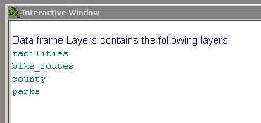
Finding the eight errors in the second script took longer. The errors in the second script included misspellings, incorrect punctuation, and arguments along with incorrect mxd and path names. Once corrected, the script printed out a list of layers in the data frame as shown in Figure 2.

Figure 2
Second Script - Layers in Data Frame
Although in retrospect it was relatively easy, the third script took the longest. This was due primarily to determining where to place the try-except statement which, once placed correctly, allowed the script to run through to completion with an error message being printed for Part A and select data frame properties being printed for Part B. These results are shown in Figure 3.

Figure 3
Third Script - Error Message and Specified Data Frame Properties 

The step-through mode of the debugger was quite helpful for this assignment. All the techniques for error and exception handling will be very useful in future assignments during the course and employment.

Friday, March 21, 2014

GIS3015 Module 9 Lab: Isarithmic Mapping

Utilizing contours formed by connecting points of equal values, isarithmic maps are useful for illustrating continuous data such as elevation and topography, barometric pressure, and precipitation. This module’s exercise focused on the average annual precipitation of Washington State and involved the completion of two isarithmic maps, one symbolized with the continuous tone method and the other symbolized with hypsometric tints.
As seen in the first map, the continuous tone technique is a proportionate tonal representation of each surface point’s value. Because this results in a gradual change in color with changes in quantity, distinguishing between quantities can be difficult when trying to relate the values in the legend with distinct locations on the map. That is why I chose to provide contour lines on this type of map. Contour lines provide “break points” in precipitation amounts relative to the legend.
Map 1: Continuous Tone Isarithmic Map
Average Annual Precipitation: Washington State (1981 - 2010)
Hypsometric tints were used for the second map. Hypsometric tinting has discrete breaks between ranges of values. The abrupt changes of color enable a viewer to more easily distinguish the differences between values. Unlike continuous tone maps, maps with hypsometric tinting can be used easily without contour lines. Creating the map from the data involved converting the raster data to integers and then manually forming classes to symbolize.
Map 2: Hypsometric Tints Isarithmic Map
Average Annual Precipitation: Washington State (1981 - 2010)

For both of these precipitation maps I selected a vertical-format legend for a couple of reasons. The first reason is that precipitation is a "vertical" measurement of volume (imagine a rain gauge) with values increasing toward the top. The other reason is that greater precipitation generally is associated with higher elevations. A vertical format legend echoes those relationships (lower/dryer, higher/wetter). Deciding which legend format to use was definitely the easier part of implementing it. Trying to remember where and how to change the symbology and format ended up being a bit time-consuming due to minimal experience.  I’m glad to say that that is improving with every lab exercise.  With their use of hillshading effect and vibrant color ramps, these maps rank among my favorites to create so far.