Showing posts with label Module 8. Show all posts

Tuesday, October 28, 2014

GIS4035 Module 8: Thermal & Multispectral Analysis

Building on what was practiced in Module 7 Lab, additional experimentation was done with different band combinations and adjustments of breakpoints after composites were created from layers in both ERDAS Imagine and ArcMap. Thermal imagery allows the comparison of different features by the energy emitted. This is dependent not only on the material but also on season,  time of day, and moisture content. The following map was created after much experimentation with different band combinations, including some adjustments of breakpoints. The goal was to obtain an image and band combination in which a selected feature really stood out.
Thermal and Multispectral Analysis
Feature: Lake

Friday, July 18, 2014

GIS 4102 – GIS Programming Module 8 – Working with Rasters

The purpose of this week's lab assignment was to produce a composite raster from 5 intermediate rasters which were created using various aspects of  the spatial analyst extension. After writing code to determine whether the spatial analyst extension was available, it was checked out, and the fun began. Three land cover classifications were assigned identical values; reclassification of the land cover raster was based on those new values. From the elevation raster four intermediate rasters were created based on slope and aspect values (slope between 5-20° and aspect between 150-270°). Finally, the five temporary rasters were combined into one raster which was saved, and the spatial analyst extension was checked in.


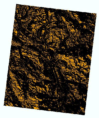
Final Raster Depicting Landcover Classification 1,
Slope 5-20°, and Aspect 150-270°
The main problem that I had with this particular script was that the outcome did not match the sample provided in the lab instructions. I had three colors in ArcMap instead of two. A big concern is that I would not have caught this error (since my script ran without trouble or messages) except that I was able to make this comparison and noticed the difference between my results and the lab instructions sample. The resolution of this issue turned out to be rather simple.

Because I remembered being confused by the inclusion of “NODATA” as a parameter in the reclassify portion of the lab exercise on p. 17 which is what I modeled my script on, I revisited that information in the text and learned that the 4th parameter is optional. I removed “NODATA” from my script, ran it again, and got the desired results, shown here.

With the completion of each lab, I am more impressed by what can be done in ArcMap with Python. I'm looking forward to the next lab!

Thursday, July 10, 2014

GIS4048 Location Decisions – Homing in on Alachua County

This module's lab exercise had students performing as consultants for a professional couple relocating to Gainesville in Alachua, Florida. Their goal is to find a home that is not only convenient to both workplaces (North Florida Regional Medical Center and University of Florida) but also is in a neighborhood of primarily owner occupants in their 40s. To accomplish this required demographic information from the US Census as well as school and medical facility datasets.

Analysis of Potential Home Locations by Different Criteria
With this information, the Euclidean Distance ("as the crow flies") tool first was used to generate distance zones around the hospital and then again around the university. Each of these raster layers was then reclassified to defined intervals to obtain ranked values. Identical color ramps were selected for easier comparison between data frames. The age and ownership layers were generated by adding fields to the applicable attribute tables and then using the field calculator to determine percentages. Again, the color ramps were selected so that the least ideal areas were shown in cool colors and the most ideal colors were shown with warm colors for easier comparison. These four data frames are shown on the first map with 3 census tracts meeting the ideal condition highlighted in each data frame.

The second map is composed of data frames created using the Weighted Overlay tool.  A model was utilized for this part with each factor given equal weight in the model. The usefulness of a model was demonstrated when the imaginary couple decided that they really didn't want to deal with Alachua County traffic after all and would prefer to find a home closer to work. The model was adjusted, giving higher weights for proximity to work and lower weights to the age and ownership criteria.  Changing values like this to accommodate a client's reconsiderations took very little time or effort.

Weighted Analyses of Potential Home Locations
A base map was included as an additional, separate map. After trying to pack all the above information into two maps, it became obvious that a larger format would have been a wise choice. Using weighted analysis is applicable not only to location selection for a residence, but also to determine feasibility studies including suitability of sites for farming, construction of a high-rise or ski slope, and so on.


Friday, March 7, 2014

GIS3015 Module 8 Lab: Proportional Symbol Mapping

The Proportional Symbol Mapping lab walked students through the development of two maps about wine consumption in Europe utilizing proportional symbols. The first map used data for all of Europe with a couple of exceptions and was created after joining the data from Excel with the shapefile in ArcMap. The second map built on the same information, but focused on only seven western Europe nations. Completing the exercise included combining the geographical features of several countries into one feature for each of those countries by the use of the Dissolve tool in Geoprocessing, reprojecting the shapefile, and then adding the wine consumption data. The consumption data was reviewed for discrepancies or omissions that might cause issues, and then was saved as a .csv before it was added to ArcMap through Joins and Relates. After viewing results of using the data as received from the Wine Institute, the quantities were then reduced using the third root with the field calculator in the attribute table and then used for the map. Initially I preferred the open look of hollow symbols for these results, but eventually decided to go with filled circles. I'm still on the fence about both options. What I knew unquestionably from the beginning was that I would use wine-based colors for the maps, reflecting one of my favorites ~ Cabernet Sauvignon. (Initially I had selected the hollow circles to enable the countries' borders to remain visible, and also to give a nod to another European favorite, Champagne.) Unaware at the start that a legend was deliberately not part of this lab, I have a gaping space on my first map and a bit of a queasy feeling about turning in an incomplete map. I stayed true to the instructions for the lab, but I'll fess up to spending some time trying to figure out how to produce a legend for this type of map. That will have to wait for a future project! This first map was completed exclusively in ArcMap.
Wine Consumption in Europe ~ 2010
The second map was begun in ArcMap and completed in Adobe Illustrator. I'll confess right here that I am so looking forward to the day when Illustrator actually feels like an efficient pathway to an awesome map. For now, I spend a lot of time consulting resources and wandering around the menus. The symbolization was a lot of fun, combining the circles and wine bottles and adding labels. Unfortunately, something which I still have not identified (but probably having to do with manipulating files in directory in preparation for uploading), caused all my wine bottles to disappear from the face of my map after I had exported a jpeg. I couldn't figure out where they went or how to get them back, so that part of my .ai document had to be redone. Another thing that was a bit frustrating was having a color scheme started in ArcMap and then opening the exported file in Illustrator to find significant color differences.  The worst was discovering that the North Sea and Atlantic Ocean were lavender instead of the blue I had selected.  Maybe it has been an especially cold year in that region as well, but I changed the color rather than retain the lavender look.
Wine Consumption in Western Europe ~ 2010
With the information shown directly below each country's name, I think the second map is easier to read and use. However, that type of symbology does take up a lot of space, so it wouldn't be appropriate for maps with a lot of data. Now that this project is finished, I do believe I'll go relax with a nice red.