Tuesday, December 9, 2014

GIS4930 Module 4 - Final Presentation (Food Deserts PPT)

Weeks of working with open source software have come together finally. Working with QGIS, Tilemill, MapBox, and Leaflet has been quite an experience, and definitely was enough to develop preference for some software over others. The creation of a web map essentially from scratch was a challenge initially but easier to do as time and experience increased. Completing an analysis for food deserts in my hometown (Marshall, Michigan) was fun as well as interesting, since it produced some results which I had not expected. Along the way, much more was learned about food deserts, their impact, and potential solutions. One of my favorite finds was the USDA's Food Access Research Atlas which can be found here with additional explanatory information available here. The USDA's site enables anyone to investigate food deserts by census tract.

The culmination of the project was the assembling of all the information and experiences into a PowerPoint presentation complete with audio which was a new experience. A link to the presentation is included here, along with a screenshot and link to the web map created for this project.

Food Deserts in the City of Hospitality: An Analysis of Marshall, Michigan and Vicinity
(PowerPoint Presentation)

(Web Map)


Screenshot of web map created with QGIS, Tilemill, MapBox, and Leaflet
For the time being that is enough about food deserts. Now it's time to move on to food desserts.

Sunday, November 23, 2014

GIS4930 Module 4 - Tiling & Basemap Creation

Compilation of the grocery store layer included referencing several online sources plus verifying the information in Google Streetview. Online sources included Yellow Pages, Manta, and Google Maps which turned out not to be very reliable. Two grocery stores were shown in completely wrong locations. This was verified by personal knowledge and double-checking street view. Verifying grocery stores in the outlying rural areas involved more research to verify whether they were full-service or convenience stores (street view, store websites or descriptions, and reviews were used). Grocery stores outside the study area were included, because of the 10-mile marker used to define rural food deserts. (http://www.ers.usda.gov/data-products/food-access-research-atlas/documentation.aspx) Addresses for the grocery stores were tabulated in Excel, saved as csv file, and geocoded before performing the Near analysis to determine which urban census tract centroids exceeded the 1-mile marker and which rural census tract centroids exceeded the 10-mile distance from a grocery store.

Centroids of the census tracts were calculated to provide a comparison point for the one-mile marker food desert determinant (urban) and 10-mile marker (rural). Interestingly, the centroid for one of the rural census tracts landed inside one of the city census tracts. Both city census tracts were considered to be food deserts which surprised me. If one of the grocery stores had been located on the east end of town or farther south, at least one of the city census tracts probably would not have been classified as a food desert. The grocery stores are both located near the western edge of town (and extreme NW part of the larger urban census tract). Because of the town size and number of grocery stores, this type of analysis might not be as informative as anticipated. Perhaps an evaluation by census block would be more appropriate to really define the at-risk areas, or an assessment by residents’ age and mobility/transportation issues could be done. I was surprised that at least one of the two southern rural census tracts was not a food desert. However, the grocery stores in that area are of a smaller nature and do not carry stock nearly as comprehensive as a chain grocery store would. So while not technically food deserts, these rural areas might still be prone to a lower-quality diet unless supplemented with home-grown produce.

The process of creating a web map of food deserts included tiling the shapefiles described above. Tiling a shapefile enables more rapid loading of layers into a web map because the layers are displayed in smaller portions (tiles). In TileMill each of the data layers for this map was centered in a tight-fitting bounding box with a centralized marker. The zoom level was adjusted so that the resulting tiles would be 10MB. Each of these map layers had up to 19 tiles. The default world layer was removed by editing the code, and the symbology (colors, opacity) for the layers was adjusted as needed. Each layer was exported for use in Mapbox and by default was sent off to a folder not of my choosing. I opted to re-organize those layers into project folders prior to adding them to the map in Mapbox. The method of saving layers or projects in both TileMill and Mapbox was not very intuitive for me (save/don't save, save again, export, etc.), so several times some steps had to be repeated in order to ensure that I had the desired product. As so often happens, this was just enough exposure to new software to let me know how much there is to learn! The screenshot below shows the food deserts, census tract boundaries, and grocery stores added to the revised basemap in Mapbox.


Food Deserts in Marshall, Michigan
with Census Tract Boundaries and Grocery Stores
Created with TileMill and Mapbox

Sunday, November 16, 2014

GIS4930 Module 4 - Tilemill & Leaflet

The exploration of opensource software for GIS purposes continued this week with the focus on Tilemill and Leaflet. Shapefiles were imported into Tilemill which already had a basemap in place. Arcmap was used to classify the food deserts by population (QGIS could have been used also) before selecting the color scheme in Color Brewer. This color scheme was entered into the Tilemill source code. The Leaflet code editing was terribly confusing, but with a lot of referencing previous instructions, double-checking coding changes, verifying paths, and re-reading of instructions, I made it through. OpenCage Geocoder was utilized to find latitude and longitude for specific addresses. Markers and shapes with popup text boxes were edited in the code. Layer groups were created and the ability to toggle layers on or off was coded. geocoder was added to the source code for finding locations. Interestingly enough, it went to locations within a few blocks of the input addresses, but not to the exact address location specified. Its reliability indicates that it should be investigated further. Throughout the process of editing the Leaflet code, the text and html files were saved incrementally, keeping previous copies in case something really got messed up during the editing process. The gods of coding must have been with me this week though, because I made it through all the Tilemill and Leaflet coding without any errors. What a lovely surprise that was!

Here's the link to the final web map: Food Deserts of Southeast Escambia County which opens up this:
Food Deserts of Southeast Escambia County


Thursday, November 13, 2014

GIS4035 Module 10: Supervised Classification

ERDAS Imagine was used to develop two different land use maps during this module, with the method of supervised classification being the focus of the exercises. In areas of interest (AOIs), polygons were drawn around representative pixels of different land uses or land covers, or a polygon was "grown" from a seed pixel to encompass a sample of a land use or land cover area. These samples ("signatures") were then used to classify the remainder of the area covered by the image. The classes were critiqued using histograms and Mean (statistically speaking) Plots, and additional signatures were gathered as needed. (That was the intent anyway. Initially I thought the classification was looking fairly decent after some adjustments, but then I noticed something fishy about the roads, including the acreage attributed to roads. Obviously there is some other feature lumped in with roads which needs to be evaluated further.) After the additional signatures were incorporated, the histograms and Mean Plots were used to critique the classification again. Bands 3, 4, and 5 had the least amount of overlap, and so various combinations of them were used to edit the signature colors before finally settling on R3, G4, B5 for the Germantown map shown below. The image was classified with this band combination, and a distance file was created. The purpose of the distance file was to highlight specific areas which might have been misclassified. Similar classes were merged by the process of recoding, and areas were calculated.
Supervised Land Use Classification
Germantown, Maryland

Tuesday, November 11, 2014

GIS4930 Module 4 - Intro to QGIS (Prepare Week)

Prepare week for this module started off with an introduction to QGIS, an open source, desktop GIS. The similarities between QGIS and ArcGIS are significant, but there are several differences as well. QGIS did reveal a few quirks, one being that an added layer did not show up in its correct location, but what could possibly be bad about UWF being in the Bahamas at this time of year? UWF's location was easily corrected by removing and re-adding the layer to the map. A difficulty I encountered was not being able to find adequate help resources (in a timely manner) for issues I experienced while using QGIS. Adding and adjusting bar scales was much more involved in QGIS than it is in ArcGIS. The use of data frames in the composer was a particular challenge for me. Frequently my data frame would be void of information after changes were made elsewhere in the composer. Hopefully more experience will alleviate those issues.

All that being said, a definite advantage to QGIS is that it's free and available to anyone. This would be beneficial for small businesses and non-profits which do not have the financial resources available to invest in ArcGIS.
University of West Florida
(Introductory QGIS Map)
For this module's project, QGIS was used to perform several processes which have been utilized in ArcGIS. These included re-projection, clipping, selecting by attributes, selection by polygon (this turned out to be a challenge), and centroid generation. From this information, food deserts were calculated based on whether the centroids of the census blocks were within 1 mile of a grocery store.

Statistics were also generated in QGIS after using an edit session to delete unnecessary columns in the attribute table for the food desert shapefile and again for the non-food desert shapefile. The results of these processes are shown in the following map of Food Deserts and Non-Food Desert areas in Pensacola, Florida.
Food Deserts and Non-Food Deserts of Pensacola
Escambia County, Florida

Tuesday, November 4, 2014

GIS4035 Module 9: Unsupervised Classification

Unsupervised classification of land cover allows the software to group pixels according to similarity (in this case creating 50 different classes). While this simplifies the classification process, the software is unable to distinguish different surfaces which reflect similarly. Because of this the results of unsupervised classification need to be reviewed and adjusted by an analyst. For instance, some grassy athletic fields (identified by soccer nets and light fixtures) reflected similarly to paved surfaces and were classified accordingly during the process of unsupervised classification. After review of the classes created with unsupervised classification, the pixels grouped like this were manually assigned to a more appropriate class. The reviewing process was made easier with the use of the Swipe, Flicker, and Blend tools along with the use of color-highlighting of pixels. 100% accuracy is not expected with classification. Some pixel groups did not clearly belong to one particular class; these pixel groups were assigned to a Mixed class. A few dormitories appear to have sod roofs, but this is due to those pixels being classified as grass like the overwhelming majority of pixels in a particular class.

After the image was reviewed and classes manually adjusted, the classes were merged to reduce the number to five using Recode. In the Recode Table, an area column was created from which percentages of permeable and impermeable surface areas were calculated. In this case, the information was transferred to Excel for computations. The resultant map shows the recoded image along with acreages for each of the classes of land cover and the percentages of permeable and impermeable surface area.
Unsupervised Classification of Land Cover and Surface Area
University of West Florida Campus


Tuesday, October 28, 2014

GIS4035 Module 8: Thermal & Multispectral Analysis

Building on what was practiced in Module 7 Lab, additional experimentation was done with different band combinations and adjustments of breakpoints after composites were created from layers in both ERDAS Imagine and ArcMap. Thermal imagery allows the comparison of different features by the energy emitted. This is dependent not only on the material but also on season,  time of day, and moisture content. The following map was created after much experimentation with different band combinations, including some adjustments of breakpoints. The goal was to obtain an image and band combination in which a selected feature really stood out.
Thermal and Multispectral Analysis
Feature: Lake

Sunday, October 26, 2014

GIS4930 Project 3 - Statistical Analysis with ArcGIS (Analyze)

The examination of various socio-economic factors in facilitating the ability to predict methamphetamine lab locations began with the Ordinary Least Squares (OLS) regression to help assure the creation of a good model. Initially all independent (explanatory) variables under consideration in this study were applied to the dependent variable (meth lab locations) as a group. The results were examined for redundancy, statistical significance, and a correlation between the independent and dependent variables. Following this critique of the results, the variable was evaluated for consideration of inclusion based on considered importance to the study. The goal of the OLS regression was a return of a high Adjusted R-Square value. Independent variables were removed individually in an effort to maximize the Adjusted R-Square value based on a critique of the results. This was followed by another run of the OLS tool. This process was reiterated numerous times until satisfactory results were achieved. A table of the final OLS results follows:
Final OLS Results Table
To inspect for bias, the OLS regression's Jarque-Bera Statistic Score was checked along with the histograms of a scatter plot matrix. Finally, the Standard Residual values for each census tract were added to the map for visual critique. Most of the two-county area was predicted accurately with this model as shown in the map below. Additional work would include resolving the high and low residuals.
Meth Lab Locations and Standard Residual Values
Charleston, West Virginia, with Kanawha and Putnam Counties

Tuesday, October 21, 2014

GIS4035 Module 7: Multispectral Analysis

Map 2: Snow identified with band
combination Red: 5, Green: 4, Blue: 3
Map 1: Water feature identified with band
combination Red: 4, Green: 3, Blue: 2
Map 3: Lake identified with band
combination Red: 7, Green: 5, Blue: 3


This lab explored different ways to identify features using ERDAS. After reviewing histograms to identify patterns and shapes in the data, the imagery was viewed in grayscale to look for dark and light shapes as well as patterns. EMR bands were manipulated to emphasize different features in the imagery. Trying to find the right band combination to help make a feature noticeable was a challenge, but the band combination references posted on the discussion board were helpful. Exact pixel values of specific areas were obtained by using the Inquire Cursor. Map 1 shows the use of TM False Color IR to highlight bodies of water. Map 2 utilizes a Short Wave Infrared Color Composite of 5-4-3 to illustrate snow. The final map, Map 3, uses a band combination of 7-5-3 to make certain water features, such as this lake, stand out.

Saturday, October 18, 2014

GIS4930 Project 3 - Statistical Analysis with ArcGIS (Prep)

Statistical Analysis is the focus of the third project in Special Topics. This particular study will analyze a variety of socio-economic factors to determine whether there is a connection to the location of illicit methamphetamine production labs in Kanawha and Putnam Counties, West Virginia. With 2013 being a record-setting year for meth lab busts in West Virginia (Eyre), law enforcement officials will appreciate having additional information that may help locate existing meth labs or prevent additional ones from starting business.

Preparation for the statistical analysis included creating new attribute fields for the census data and then using the field calculator to determine percentages of some data. Utilizing percentages rather than raw numbers for the census tracts will provide more equalized comparison of data. Python scripting was also used to add additional attribute fields and perform related calculations in a more efficient manner. Drug Enforcement Administration (DEA) meth lab bust information with geocoded data was joined to the Census data as well. Tidying up the attribute table was done by turning off fields which wouldn't be used for the statistical analysis. The following basemap of the study area was created. It includes cities and towns which have had meth lab busts in the past.
Socio-Economic Factors and Meth Lab Locations
Study Area: Kanawha and Putnam Counties, WV
Resource:
Eyre, E. (2014, February 19). W.Va. Senate OKs anti-meth prescription bill. Charleston Gazette. Retrieved from http://wvpress.org/news/w-va-senate-oks-anti-meth-prescription-bill/

Monday, October 13, 2014

GIS4035 Module 6 - Spatial Enhancement

Spatial enhancement of satellite imagery was the focus of Module 6 Lab. The enhancement of remotely sensed imagery enables viewers to extract more information from the imagery than originally expected. Enhancements can be used to emphasize particular aspects or features in the imagery or to correct errors resulting from sensor issues. ArcMap and ERDAS complement each other in the application of spatial enhancements.

After practicing the application of various enhancements to other imagery, the final exercise in this lab involved applying image enhancements to a Landsat 7 image. The purpose of the enhancements was to improve the image quality by reducing the visual impact of the "striping" effect of a sensor malfunction. The specific goal was to minimize the striping while maintaining the highest degree of detail as possible. Enhancements that were applied to the imagery to complete this map included Fourier Transform, 3x3 Sharpen Filter, Haze Reduction, Noise Reduction, Contrast Adjustment, and Brightness Adjustment.
Landsat 7 Imagery after the application of several spatial enhancements.
This exercise also served as a reminder of how finicky software can be. For undetermined reasons, both ArcMap and ERDAS required multiple attempts at completing some processes either because they resulted in completely unanticipated results or because they would not run at all. In one case, closing completely out of eDesktop and attempting the process again after re-starting resolved the issue. Other processes were unsuccessful primarily because of lack of experience in how to use them optimally. This was especially true with histogram adjustment. Additional practice will be beneficial in learning the ins and outs of spatial enhancement.

Thursday, October 9, 2014

GIS4930 Module 2 - Mountain Top Removal, Appalachia Coal Region (Report)

The  Mountain Top Removal (MTR) method of coal mining in the Appalachian Mountains has been shown to impact the surrounding hydrology (Petrequin). As part of the study of applying GIS to MTR impacts, this project included creating stream and basin features. This was done by mosaicking four DEMs into one layer and then applying several Spatial Analyst Hydrology tools.

Analyzing the impact of the MTR method of coal mining on an area involved comparing imagery from two different time periods. ArcMap and ERDAS Imagine were both used with 2005 imagery to develop a signature file which was then applied to 2010 imagery to develop a map of MTR areas.

Only a portion of the 2010 data was analyzed by Group 3 for SkyTruth. The 7 bands of the 2010 Landsat imagery were consolidated using the Composite Bands tool, and the imagery was clipped to the group's study area in ArcMap. A layer with 50 classes was created in ERDAS Imagine using the Unsupervised Classification tool. Areas which appeared to be part of MTR were classed and symbolized by color accordingly with the remaining areas being classed as NonMTR. Many objects such as stream or river banks, buildings, and roads have identical spectral signatures as MTR and were included initially. They were removed from the MTR features later. In ArcMap, the classified image was reclassified with MTR being assigned a value of 1 and all other Class Names assigned blank values.

From this information, the MTR raster was converted to polygons. MTR features within 400 meters of major rivers or highways were removed from the MTR polygon layer, as were those within 50 meters of streets and other rivers. Features smaller than 40 acres were removed as well. An accuracy assessment was done with a result of 96.7%, and a comparison against the 2005 dataset was made. There was an overall decrease in acreage attributed to MTR from 2005 to 2010, but the data needs to be critiqued further. The 2005 dataset included features of less than 40 acres, while the 2010 data was restricted to features containing more than 40 acres. The 2005 dataset had more than 8,000 features, while the 2010 dataset had fewer than 500 due to the acreage restriction.

A layer package was created with this data and submitted to the group leader for compilation into one dataset for the group's study area, and a map service to present the group findings online was created. This map service was used to create an online map. A soils runoff classification layer was also added to the map. This additional data was selected because runoff from MTR sites impacts the surrounding areas. The online map can be viewed here, although the soils layer is not available to all viewers.

Resource:
Petrequin, M. (2012). Hydrological Impacts of Mountaintop Removal in Appalachia: History and Solutions (Colorado School of Mines, Department of Environmental Science and Engineering).  Retrieved from uwf.edu.

Tuesday, September 30, 2014

GIS4035 Module 5a - Intro to Electromagnetic Radiation (EMR)

This module marks the introduction to automated image classification using ERDAS Imagine in tandem with ArcGIS. After exercising the brain with a bit of mental Olympics for calculating EMR properties and an exploratory tour of ERDAS Imagine's eWorkspace, comparisons were made between Landsat Thematic Mapper imagery and Advanced Very High Resolution Radiometer (AVHRR) imagery. The map below was created in ERDAS Imagine by editing the attribute table for the provided imagery to add an area column. A subset of the imagery was created using an Inquire Box along with the Subset and Chip option. Ty discovered that the updated acreages did not transfer into ArcMap with the subset imagery and very graciously posted his solution to the problem for the benefit of the rest of the class. Thanks, Ty! His solution of creating another area column after creating the subset was very helpful. A basic map with the subset image and updated acreages was then created in ArcMap. Acreages were added to the legend through editing descriptions for labels in the symbology dialog box. Ideally a basemap would have been included as well, but eDesktop was not being very cooperative in that department this evening.

Land Classification for a Washington State site using ERDAS Imagine and ArcMap.

GIS4930 Module 2 - Mountain Top Removal, Appalachia Coal Region (Analyze)

Assessing the impact of Mountain Top Removal (MTR) mining on an area requires comparing imagery of that area taken after a period of time has passed. The Analyze portion of this module helped develop the skills to do just that. Utilizing data from SkyTruth, 2005 Landsat imagery was used in ArcMap to select training samples in known MTR polygons as well as in nonMTR areas. After changing class names, values, and colors for the samples they were compared for overlaps, and a signature file was created to be used in Supervised Classification. The same data was used in Erdas with the "Grow" tool to select several samples to add to the Signature Editor table.

The class was split into several different work groups of 3-4 students to analyze the 2010 data for SkyTruth. Each group was responsible for 2 to 4 images. After the preliminary exercise, the 2010 imagery was prepared by first using the Composite Bands tool to consolidate the 7 bands of the Landsat file and then clipping the imagery to the group's study area in ArcMap. In Erdas the Unsupervised Classification tool was used to create a layer with 50 classes. Areas which seemed to be part of MTR were classed and symbolized by color accordingly. Distinguishing the MTR areas was difficult for me. The remaining areas were classed as NonMTR and symbolized by a different color. Because identical spectral signatures can be assigned to very different types of features, many objects which are not MTR areas are included in the MTR class. This will be accounted for at a later time.

Back in ArcMap, the classified image was reclassified with MTR being assigned a value of 1 and all other Class Names assigned blank values. The resulting image is shown here:
2010 Landsat Imagery Classified for MTR
(NOTE: This image includes some nonMTR features with the same spectral signature as MTR.)
From this information, the MTR raster will need to be converted to polygons and smaller MTR areas removed. Buffers will be created around roads and rivers, and MTR areas within the buffers will be removed. An accuracy assessment will be done as well as a comparison with the 2005 dataset. Each group member will submit packaged data to the group leader for compilation into one dataset for the study area. Finally a map service to present the group findings online will be created. Look for this next week!

Thursday, September 25, 2014

GIS4930 Module 2 - Mountain Top Removal, Appalachia Coal Region (Prepare)

This was a two-part lab preparing for a project concerning the coal-mining process of mountain top removal in the Appalachian Mountains of West Virginia. The first part of the lab involved learning about LiDAR as well as creating and viewing LAS datasets in ArcMap. Different point symbology and different filters impact how useful the information can be.

The second part of the lab involved creating stream and basin features from USGS Digital Elevation Models (DEMs). A mosaic of four DEMs which Group 3 will be using this module was created and clipped to the extent of the class's study area. Several tools of the Hydrology toolset of Spatial Analyst were used then:

1. Fill tool to fill in low spots/pooling areas
2. Flow Direction tool to assign values to each pixel indicating direction of flow across the individual pixels 
3. Flow Accumulation tool to indicate the number of other cells flowing into each cell (to show possible streams)
4. Con tool to eliminate features which likely are not streams
6. Stream to Feature tool to create streams layer
7. Basin tool to create watershed layer

The created streams and basin layers are depicted in this map:
Group 3 - Streams and Basins
Appalachian Mountains

Tuesday, September 23, 2014

GIS4035 Module 4 - Ground Truthing and Accuracy Assessment


Land Use / Land Cover Classification Accuracy
Pascagoula, Mississippi
This module included a lot of completely new material for me. Although the lab exercise was straightforward and rather easy, the preparatory information was rather overwhelming. The lab exercise itself involved using last module's classification map and adding sample points. The actual land use or land cover for these sample points was determined using Google Maps Street View where possible or zooming in on Google Maps aerial view. This was compared to the classification selected last week for the same points. The results were tabulated for accuracy. Best accuracy for this map was determined for non-forested wetlands, probably because they were so easy to distinguish. Barren lands had lowest accuracy because of having classified open areas as barren lands when a better classification would have been herbaceous rangeland. The lab itself was a fun exercise. The resultant map with sample points is shown here.

Monday, September 22, 2014

GIS4930 Network Analyst - Report Week

Producing maps with the routes created last week was the focus of this week's lab. The patient evacuation maps were inserted into a pamphlet template which included information for the patients and their families. Each of the emergency supply routes to the evacuation shelters was shown on its own sheet which included turn-by-turn driving instructions for the National Guard crew members and other emergency workers. These maps were specifically created in grayscale for ease of reproduction as requested; following that same thought process, the maps were created in an 8 1/2 x 11 format for easier handling, storage, and reproduction. 


Emergency Supply Delivery Route Map
with Turn-by-Turn Directions
The map shown here is representative of the supply route maps. It was not a favorite to complete, but is included as an honor for having the distinction of providing plenty of opportunities for me to learn from my mistakes. I feel so much smarter already. There were two particular challenges. One challenge encountered with this part of the project was trying to ensure that there was suitable contrast between the different map elements. The other challenge was fitting all the required information on a single sheet and still retaining legibility.


The final map was created for media distribution to the public. Because the map was requested for use in print media as well as on television, simplicity was expected. The map shows the shelter locations with primary streets along with the addresses of the evacuation shelters and some miscellaneous shelter-related information obtained from the City of Tampa and Hillsborough County. The analysis aspect of this map was completed in ArcMap using Network Analyst and the map was finished using Adobe Illustrator.

The entire project from start to finish was very comprehensive, very practical, and very educational.

Friday, September 19, 2014

GIS4035 Module 3 - Land Use / Land Cover Classification Mapping

Land Use / Land Cover Classification
(Pascagoula, Mississippi)
Creating a classified land use and land cover (LULC) map from an aerial image was the goal for this lab. After a polygon feature shapefile was created and additional fields were added to the attribute table for LULC code and description, Editor was used to create features by digitizing polygons for different categories of land use and land cover. Vertex and edge snapping were used to digitize adjacent polygons, but eventually some issues involving the Snapping Toolbar were encountered that could not be resolved promptly. The ability to clip out polygons from within other polygons is a skill that will be handy for future projects. The identify tool was very helpful while clipping out polygons.

Although time-consuming, especially because of the scale and zoom level I selected (it seemed like a good choice initially), this was a very enjoyable lab to complete.

Monday, September 15, 2014

GIS4930 Network Analyst - Analyze Week

The analysis portion of the Tampa Hurricane Planning project built on the information prepared in the previous module. The map shows routes from the National Guard Armory to three schools serving as hurricane shelters for emergency supply distribution runs and the routes from Tampa General Hospital to Memorial Hospital and St. Joseph’s Hospital for the evacuation of patients prior to the hurricane’s arrival. The map also outlines the areas to be served by the three emergency shelters (identified on the map).
Tampa Hurricane Planning - Routes

To prepare this map, a new network dataset was created from the streets layer prepared earlier with attributes selected to create the fastest, simplest routes rather than shortest-distance routes with flooded roads closed to the public but possibly traversable by emergency vehicles.

The areas to be served by each of the storm shelters were created in Network Analyst with values selected to avoid accidentally excluding any of the study areas from the analysis and to clearly identify only one storm shelter for any area.

As done in the preparation lab, a map package was created for the map and zipped together into one folder with the metadata files, routing map image, and the process summary. Again, a sample email detailing this information and process was created as if a co-worker would be completing the project. The email included the zipped folder, details of what the City of Tampa had requested, what had been accomplished during this part of the project, and what needed to be completed yet. Items to completed next are different information brochures along with a map and supply list for emergency supply distribution. These will be done during the Report portion of the project.

Sunday, September 14, 2014

GIS4930 Network Analyst - Prepare Week

The focus of this module was preparation of data to be used for the production of a map and public information brochure by the City of Tampa in preparation for a hurricane. The City is especially interested in routing for evacuation, emergency access, and post-hurricane supplies, taking into consideration road closures. Elevation zones for the basemap were produced from a Digital Elevation Model which was classified into distinct elevation classes and symbolized. The flood zone for this hurricane (expected surge of 5.5 feet) is symbolized in red to stand out. Higher elevations are shown in other colors with 1-foot increments. Shelters, hospitals, fire and police stations, the National Guard armory, and roads are shown on the basemap as well. Symbols for facilities were shaped distinctly different from each other and generally included an associated letter designation to ensure that there was no confusion caused by color blindness or lack of familiarity. This would be important to anyone already experiencing the duress of an evacuation before an impending disaster.

Tampa Hurricane Planning Basemap
The streets layer was prepared for use as a network dataset with the addition of attribute fields for length in miles, travel time in seconds, and whether the road is in the flood zone. Interstates received the "not flooded" attribute because they are elevated. This information will be utilized in the next module.

A map package was created for the map and zipped together into one folder with the metadata files, basemap image, and the process summary. A sample email detailing this information was created as if a co-worker would be completing the project. The email included the zipped folder, details of what the City of Tampa had requested, what had been accomplished to date, and what needed to be completed yet.


Saturday, September 13, 2014

GIS4035 Module 2 - Aerial Photography Basics & Visual Interpretation of Aerial Photography

Map 1 - Degrees of Texture and Tone in an Aerial Image
Module 2 focused on the basics of aerial photography (vantage points, cameras, filtration, and films) along with how to use recognition elements to interpret aerial imagery. Recognition elements include location, tone and color, size, shape, texture, pattern, shadow, height/depth, and site, situation, and association. The first map depicted here focuses on the identification of different degrees of tone (from very light to very dark) and texture (from very fine to very coarse). Degree of tone indicates the degree of energy reflected by surfaces. Degree of texture is relative for any particular image. For this specific image, the texture ranges from very fine for water to very coarse for residential neighborhoods. For another image, these descriptions may vary significantly dependent on the nature of the subject of that particular image.

Map 2 - Features Identified by Visual Attributes
The second map focuses on utilizing other recognition elements to identify specific objects in the image. Shape and size were utilized to identify roads (long and linear), a pool (roman shape with rectangular diving board), and cars (rectangular shapes associated with large, open parking area). Shadows were used to identify a water tower (long, thin shadow with flared bottom and topped with bulbous shape), trees (slender trunks topped by clusters of fronds/branches), and a warning siren (horn-like shadow at top of tall, slender shadow which was distinctly different from the shadows of other poles in the image). Objects identified by patterns included parking spaces (herringbone pattern), utility poles (regularly spaced tall, thin objects with cross bars at the top), and houses (buildings of similar size, height, and spacing with a driveway to each structure). Some features were identified by their association with other features. This included the pier (a long, thin structure projecting from the shoreline out into the water with a shadow indicating height above the water) and a driveway (a short linear object which did not cast a shadow and leads to a house).


From personal and professional (surveying) use of aerial imagery, identification of objects is a rather comfortable practice. An area of growth for me was demonstrated in the third part of the lab which focused on comparing objects between a true color image and a false color infrared image. Along with learning more about the use of recognition elements in identifying objects in imagery, learning to interpret information from natural color and false color IR images is a skill I look forward to developing.

Sunday, August 10, 2014

GIS 4102 Module 11 - Sharing Tools

Sharing tools was the subject of the final module for GIS Programming. After modifying a script so that it could be embedded right into the pertinent tool, the script was embedded and then password protected. Embedding a script directly into the tool improves the ease with which the tool can be shared. Password protecting the script prevents anyone from viewing or exporting the script without the password. The tool's dialog box and the results from this module's embedded script can be seen here:
Results from Embedded Script and Tool's Dialog Box

Initially working with Python was frustrating, but continuing with it was fruitful. It quickly became obvious that the more Python is used, the easier it is to use and understand. While there still are several things that are not clearly understood, finding the right resource for clarification is becoming quicker. Implementing what has been learned will be important to retaining it.

And just in case anyone is wondering...having your elderly parents actively test the local hospital's emergency room to see if they will provide services at 2-for-1 cost for seniors just before final exam is not conducive to completing course work in a timely fashion. I'm just saying. (Both are fine now and in their own home again.)

Good luck to everyone in their Python and GIS endeavors!

Wednesday, August 6, 2014

GIS 4048 Final Project: Conservation Subdivision Parcel Selection

A group of developers requested assistance with locating vacant parcels in Orange County, Florida, that are suitable for the development of a conservation subdivision. Conservation subdivisions reserve about 50-70% of the buildable land for open space and group the homes on the remaining portion. Conservation subdivisions have higher home values and reduced infrastructure costs (including lower stormwater management needs), benefit wildlife, and provide open space to residents (Allen, et al., 2013). It is a win-win situation. The objectives of the project were to obtain a list of suitable parcels, calculate Euclidean distances based on clients' preferences (near major roads and conservation lands, away from airports, energy plants, and landfills), perform an intersection to remove parcels that could not be used for subdivision development, conduct weighted analyses, determine three vacant parcels that meet the criteria, and provide the results (maps, spreadsheet, and report of parcel information with owner contact information) to the clients.
Such an extensive task seemed quite daunting at first. Deciding what to take on as a project alone was time-consuming. This was a good, practical experience as I learned that finding necessary, accurate, and complete data can be quite difficult at times. Having polygons for the parcels instead of a single point for each parcel would have been more informative for the clients. Along the way there were several accidental discoveries about ArcMap's quirks which I hope to avoid with future projects. Although it was extremely time-consuming, I really enjoyed working on this project. I haven’t done any subdivision work for decades and was excited to discover the concept of conservation subdivisions. A PowerPoint presentation describing the project is available here: Conservation Subdivision Parcel Selection
Examples of Output Generated for Clients
Resources:

Allen, S., Moore, S., Moorman, L., Moorman, C., Peterson, N., & Hess, G. (n.d.).  Conservation Subdivision Handbook (North Carolina Forest Service and North Carolina State University Publication No. AG-742). Retrieved from http://www.ces.ncsu.edu/forestry/pdf/ag/ag742.pdf.

Allen, S., Moorman, C., Peterson, M.N., Hess, G., & Moore, S. (2013). Predicting success incorporating conservation subdivisions into land use planning. Land Use Policy, 33, 31–35. http://dx.doi.org/10.1016/j.landusepol.2012.12.001. (Article in its entirety is available at http://www4.ncsu.edu/~mnpeters/documents/Allen_etal_2013_LUP_000.pdf .)


Tuesday, July 29, 2014

GIS 4102 Module 10 - Creating Custom Tools

Learning about script tools this module was quite awesome. The use of parameters instead of hard-coded information as is used in stand-alone scripts provides so much flexibility and transferability of the script. Another advantage of script tools over stand-alone scripts is that message statements which are written to a progress dialog box and the Results window can be in a script tool. This allows the retrieval of results messages at a later time. Stand-alone script messages are printed to the interactive window and cannot be retrieved later. While the use of stand-alone scripts requires some knowledge of Python, the use of script tools does not require knowledge of Python. The script tool's dialog box is a convenient way for users to enter parameters with validation and error-checking included. The script tool window for this assignment is shown here:
Script Tool Window Showing Parameters Ready for Input
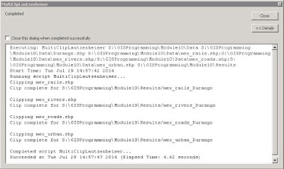
Even the creation of a script tool is relatively easy. After verifying that the stand-alone script forming the basis of the script tool works properly, a new script tool is added to a toolbox in ArcMap's Catalog. The new script tool is given a name, label, description, script file, and so on before parameters are added. After properties for each parameter are set, the original stand-alone script is edited to replace hard-coded filepaths or file names with the applicable parameters from the script tool. Print messages in the stand-alone script are replaced with message statements. This image shows the messages after running the tool for this assignment:
Resulting Messages from a Script Tool Which Clips
Several Layers to a Single Feature
Once the performance of the script tool has been confirmed, the script and toolbox containing the script tool can be zipped together into a folder. VoilĂ ! It's ready to share with anyone else. Just for fun, I emailed the zipped file to myself and used it with some other data. Here's an image of Orange County, Florida, with roads and some other features clipped to the county line...another demonstration of the incredible functionality and adaptability of Python scripting:
Orange County, Florida, with Features Clipped Using Script Tool